
In the constant online culture of public relations work, mental health tends to be on the back burner. With pressures and deadlines, and the need to be online for communication can be stressful and cause burnout. But how do we effectively communicate that this is an important issue to help PR professionals improve and maintain their mental health?
The first infographic is from this Instagram account with the handle @thepresentpsychologist, walking through the stages of burnout. The second infographic is from the Center for Workplace Mental Health, titled “Burnout, Beating Burnout at Work.”
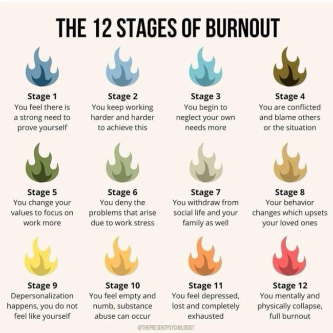
This infographic walks us through the stages of burnout for someone might experience. This is a simple but powerful visual that shows the worsening effects of burnout accompanied by clear, relatable descriptions for each one. The colors of the flame (representing the ‘burn’ or burnout) are different according to the different stages, which are numbered so they are easy to follow. This has a clean look that is easy to read. The stage numbers are bolded, and descriptions are underneath.
This infographic tells a compelling story by breaking down burnout into stages. This step-by-step visual helps viewers recognize where they are or notice it when it does happen. It’s not only informative but also a wake-up call to prioritize self-care.

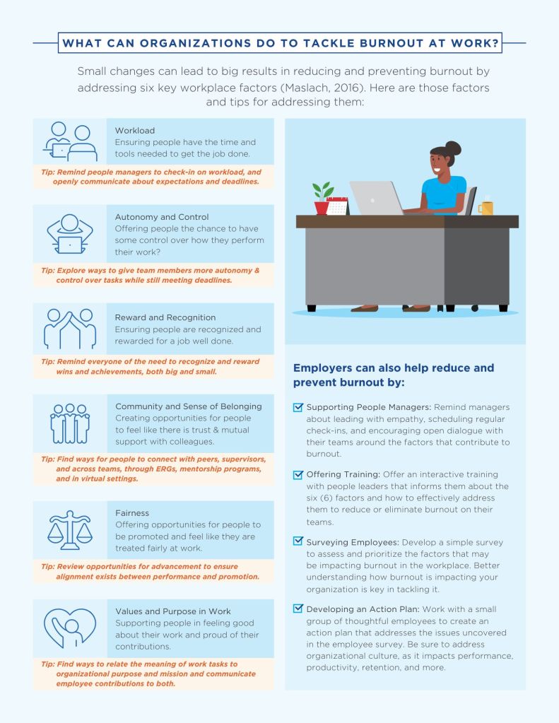
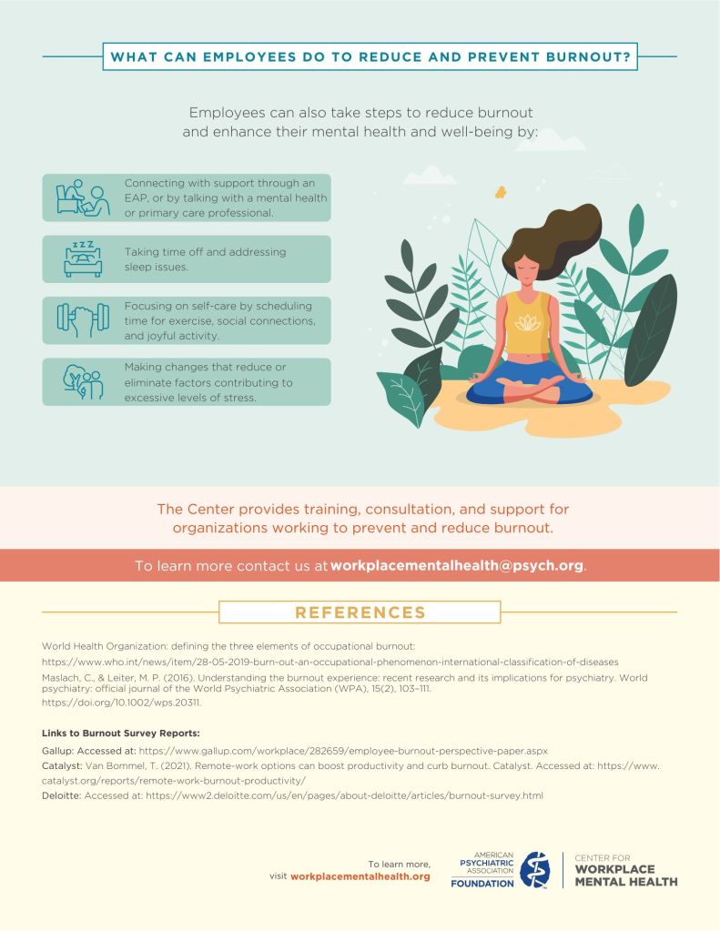
This second infographic is from the Center of Workplace Mental Health, going more in-depth about burnout, like what it is, how common it is, what employees can do to help reduce burnout, and more. It is organized into clear sections with bolded headers. The information is grouped where it flows nicely, where readers can easily follow. The colors are subtle but are used to help section the different topics. I think this infographic balances pictures and information well; it’s not overwhelming information, but still gets the message across. By combining definitions, real statistics, and solutions, this infographic tells a full, well-rounded story about burnout.
Both of the infographics use thoughtful design elements like visuals and colors, balanced with information. Both are effective but in different ways: the “12 stages” uses visual storytelling via the flames, while “Beating Burnout at Work” balances data and actionable guidance to inform and empower whoever reads it. Together, both infographics educate, engage, and inspire action that can demonstrate the power of effective design in telling a story with data to back it up.

Leave a comment